Dimidium: Terminal color scheme crafted with science
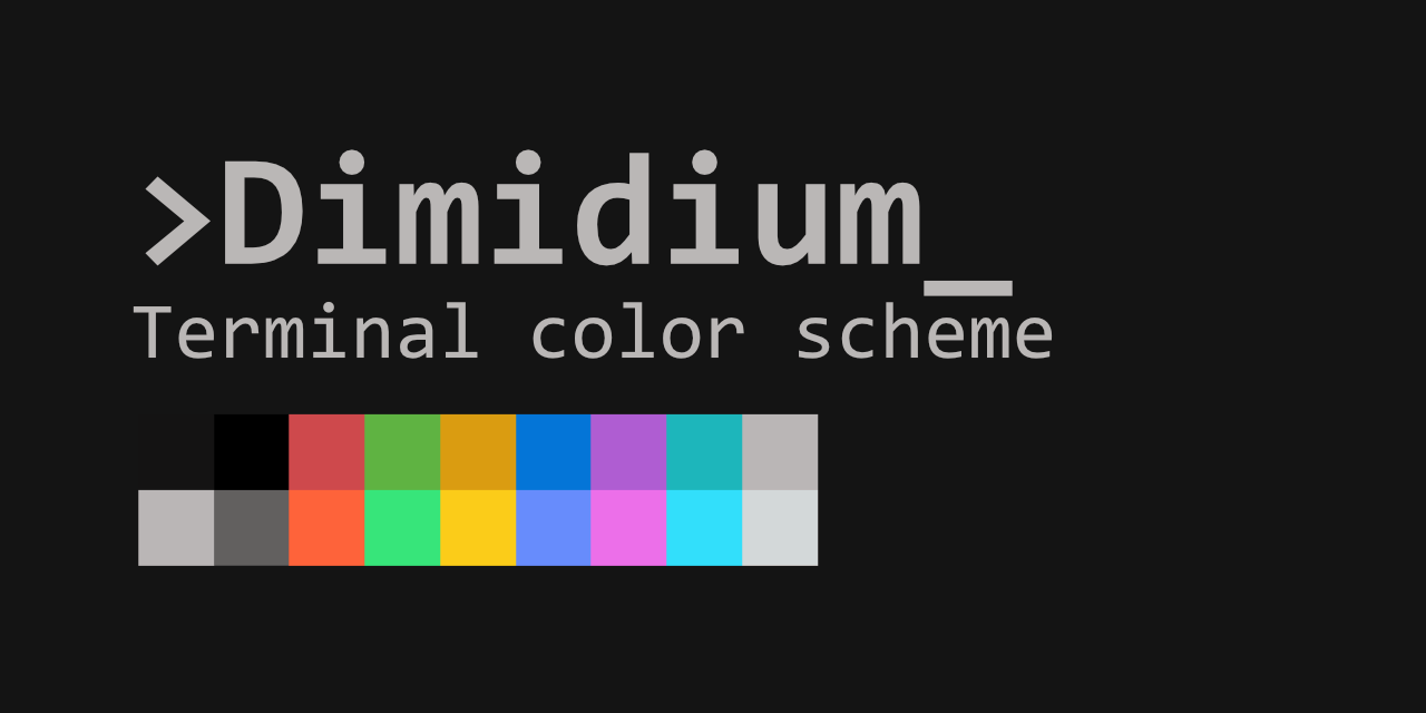
TL;DR:
Using Color Appearance Model (CAM), we can deal with human color perception scientifically.
With CAM, I made a standard-looking terminal color scheme with uniform visibility across all colors.
(Preview, Downloads)
Problem of the 16-colors
Modern terminals can use 24-bit colors, but many applications still use the ANSI 16-color scheme: K, R, G, Y, B, M, C, W, and their bright variants.
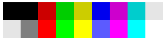 Traditional 16-color scheme
These default terminal color settings usually have blue that’s too dark. Green is too vibrant and hurts my eyes. 🥶
And there are tons of custom color schemes being shared, each made to their taste and senses.
But none of them fulfill my eyes. Common problems are:
- Name and color not matching (Red is magenta, blue is purple… etc)
- Some colors are buried in the background and hard to see
- ‘Bright’ colors are not defined, or messed up
New Standard Terminal color scheme 🌈
If it doesn’t exist, let’s create it.
Let’s reduce excessive brightness, chroma difference of the traditional terminal color scheme.
So we can get a new color scheme that is standard-looking and well-visible.
First step: Brighten up without changing hue
Let’s start by increasing the lightness of the blue color.
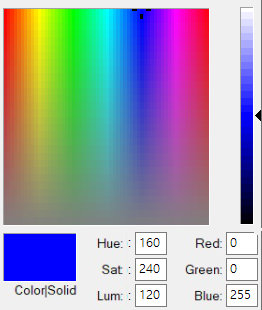
Even with the maximum B value, ■(0,0,255) it’s still too dark.
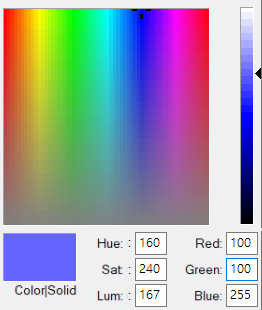
If we increase R, G to raise the lightness, ■(100,100,255) does get brighter, but a reddish tint starts to appear.
We’re in trouble from the start. 🤦
Color Appearance Model (CAM)
As you saw above, the human vision system does not respond linearly to the RGB value. Hue varies even if the same amount of R, G value changed.
This is where we need a CAM. If you’re interested in the latest CSS standards, you might have heard of Oklab and Oklch, which are also CAMs.
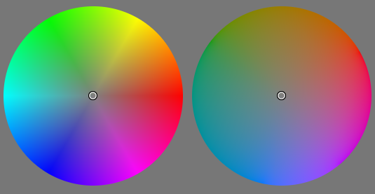 Left: Without CAM / Right: With Oklch
The lightness of the color plane is uneven with HSV (left). But with CAM, it became uniform (right).
Let’s look at the blue again using the Oklch color picker.
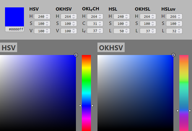 Left: Without CAM / Right: With Oklch
Compared to the top ■ #0000ff, while the left palette shows a reddish tint, the right palette using Oklch shows more appropriate blue color.
Again, First Step: Brighten up without changing hue
By increasing the lightness using Oklch, ■(72,127,255), the reddish tint is gone. It finally looks like a bright blue.
Using a CAM allows us to handle colors in a way that human perception works.
So from now on, I will tweak the terminal color scheme using a CAM. The goal is to maintain the hue while reducing extreme differences in lightness.
CAM16-UCS
The CAM I’ll use is CAM16-UCS (Color Appearance Model 2016 - Uniform Color Space).
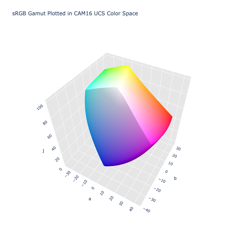 Image source: ColorAide Documentation
It represents color using 3 values: J (lightness), a (red-green), b (yellow-blue).
(Conventionally, Lightness is denoted as L* or J to distinguish it from Luminance L)
By converting the J, a, b Cartesian coordinates (x, y, z) to cylindrical coordinates (r, Φ, z), we get the 3 components of the color we want to use:
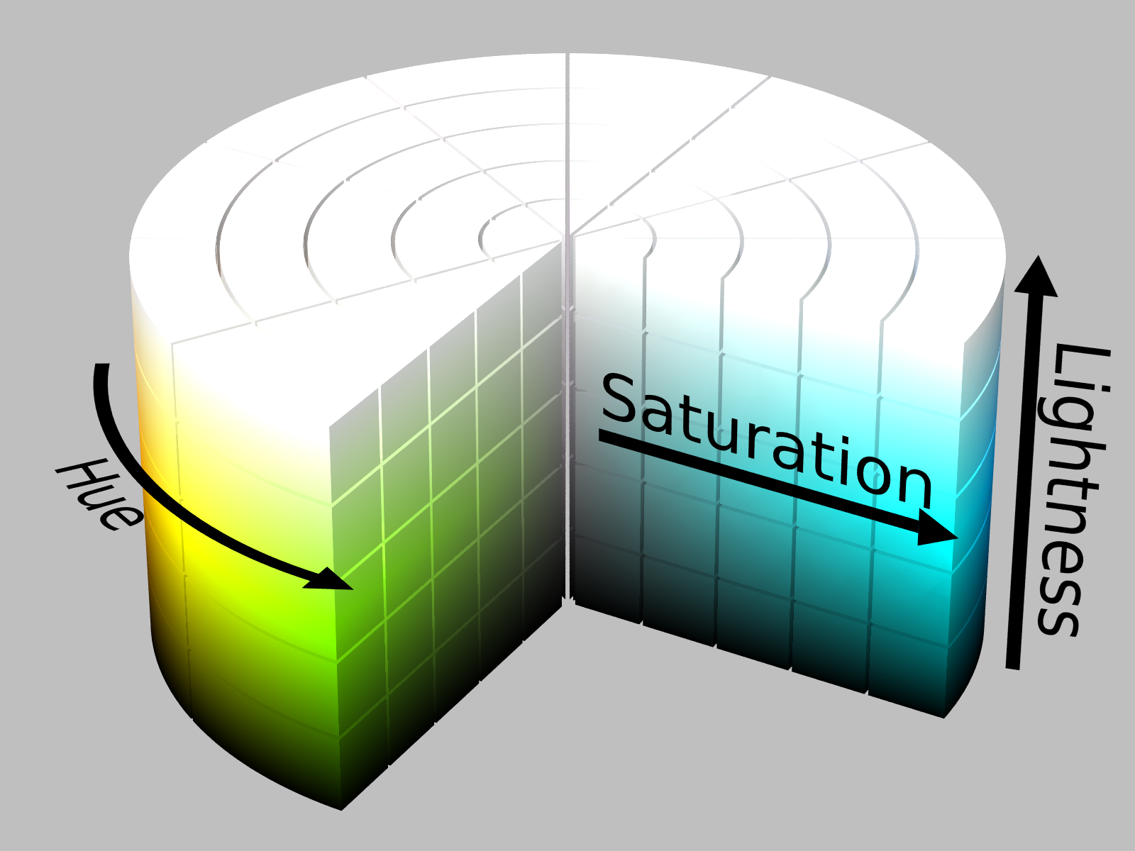 Image source: HSL and HSV - Wikipedia
J: Lightness
C: Chroma
h: Hue
(The diagrams below are for understanding purposes and may differ from the actual CAM and colors.)
Color Adjustment 🖌️
Base is xterm’s default color setting.
I’ll use the Python colour-science package for color conversion. (sRGB → CAM16-UCS)
import colour  # colour-science

# Convert to CAM16-UCS-JCh
xyz = colour.sRGB_to_XYZ(color_rgb/255)
jab = colour.XYZ_to_CAM16UCS(xyz)
color_jch = colour.models.Jab_to_JCh(jab)
Then we separate J, C, h.
j = color_jch[..., 0]
c = color_jch[..., 1]
h = color_jch[..., 2]
Lightness
Let’s start by reducing the gap between the too-dark blue and too-bright green. I’ll Thanos it by half.
(Note: ‘Dimidium’ is Latin for ‘half’.)
j_mean = np.mean(j[2:8])
j[2:8] = (j[2:8] + j_mean) / 2  # colors

j_mean = np.mean(j[10:16])
j[10:16] = (j[10:16] + j_mean) / 2  # bright colors
The lightness difference is not entirely removed. Doing so would reduce the color distinction and worsen the clipping issue I’ll explain later, making the result look strange.
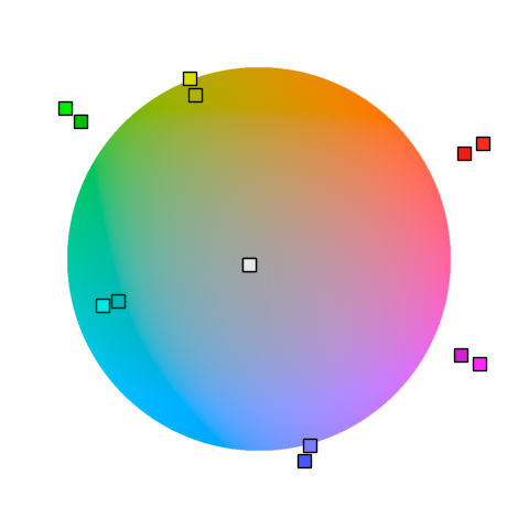
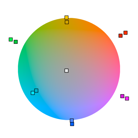
Hue
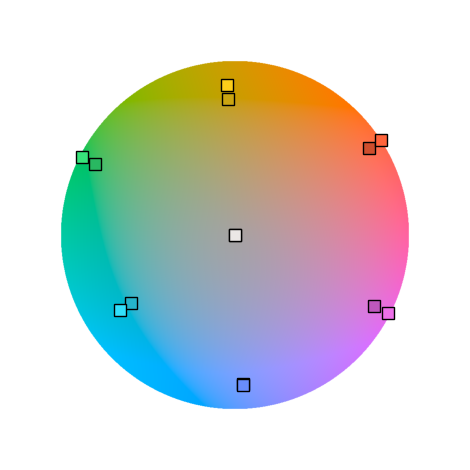
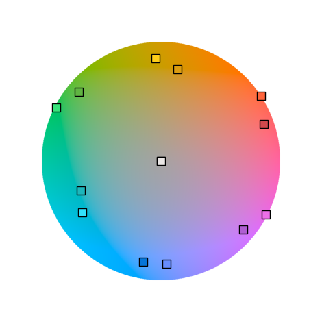
When we plot the colors on a plane, the angular spacing (=hue difference) is uneven. Yellow, in particular, is skewed towards green.
Let’s spread them out equally at 60° intervals to maximize the difference between colors.
# Set hue(mean delta to original is about 3)
h[2:8] = (30, 150, 90, 270, 330, 210)
h[2:8] += 3

h[10:16] = (30, 150, 90, 270, 330, 210)
h[10:16] += 3
 |
 |
|---|---|
| Before: Uneven hue (angle) spacing | After: Even hue (angle) spacing |
Chroma
The adjusted colors include out-of-gamut values like RGB(-32,266,128) that cannot be displayed on SDR displays. It’s something like over/under-exposure clipping in photography.
To fix this, first, let’s halve the chroma difference.
# Normalize chroma
c_min = np.min(c[2:8])
c[2:8] = (c[2:8] + c_min) / 2

c_min = np.min(c[10:16])
c[10:16] = (c[10:16] + c_min) / 2
Then we desaturate the colors proportionally to bring them back into the (0~255) range and tidy up the tones.
# clip chroma into sRGB gamut
for desaturate in np.arange(1, 0.1, -0.001):
    # Convert back to RGB
    color_jch_adj = np.stack([j, c*desaturate, h], axis=-1)
    jab = colour.models.JCh_to_Jab(color_jch_adj)
    xyz = colour.CAM16UCS_to_XYZ(jab)
    color_rgb = colour.XYZ_to_sRGB(xyz)

    if np.all(0 <= color_rgb) and np.all(color_rgb <= 1):
        color_jch = color_jch_adj
        break
|
 |
|---|---|
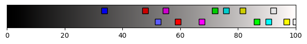
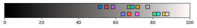
| Before: Out of sRGB gamut | After: Within sRGB gamut |
Result
Here is the result:
It’s close to the standard while ensuring all colors are well visible.
The reduced lightness difference makes red and blue more visible, and the oversaturation of cyan and green is gone.
Additional Adjustments
Some subjective adjustments to improve readability and color distinction:
Background Color
A pure (0,0,0) black background is known to be bad for readability.
I changed the background to a near-black gray (20,20,20).
Enhancing Color Distinction
I added a slight hue separation between the ‘normal’ and ‘bright’ colors to make them more distinguishable.
# Set hue(mean delta to original is about 3)
h[2:8] = (30, 150, 90, 270, 330, 210)
h[2:8] -= 10  # Originally was +3

h[10:16] = (30, 150, 90, 270, 330, 210)
h[10:16] += 3
|
 |
|---|---|
| Before: Little difference between normal/bright | After: Normal/bright more distinct |
Final Result ✨
 Dimidium color scheme
 Dimidium in the terminal
 Comparison with the traditional color scheme
Download Settings 🛠️⬇️
You can download the color scheme settings for terminals here.
https://github.com/dofuuz/dimidium
Further readings
Color appearance model - Wikipedia
Roseus colormap - perceptually uniform colormap made by me
Code
The Python code used for color generation and visualization:
Colab (May be outdated. Use code at Github to develop with.)
Try Color Appearance Models
You don’t need to know Python to use CAMs. You can experiment with CAMs at these sites.
OKLCH Color Picker & Converter